Elevate Your Small Rental with Luxe, Reversible Upgrades

A Luxe Look Without Losing Your Deposit
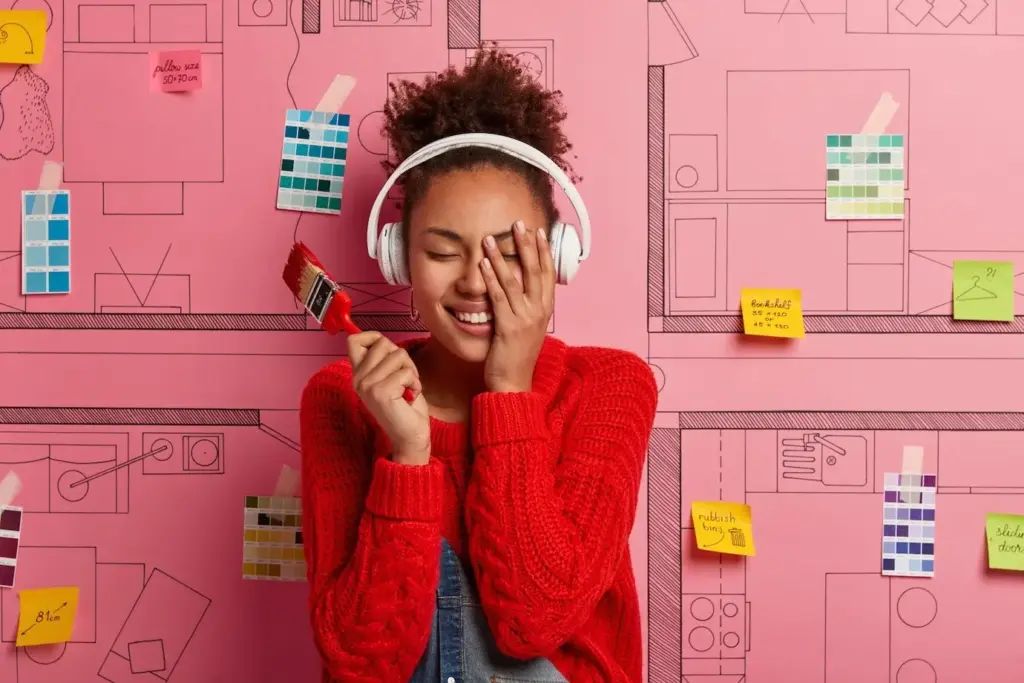
Small-Space, Big-Impact Color Strategy
Color with Light: Lamps, Shades, Bulbs
Shift perceived hue and contrast using warm 2700–3000K bulbs for evenings and 3500–4000K for task clarity, prioritizing CRI 90+ for true artwork and fabric tones. Combine downlighting, diffused table lamps, and wall‑washing plug‑ins to erase shadows, elongate walls, and create gradient transitions that feel expensive and intentional.
Textiles as Paint: Curtains, Rugs, Bedding
Treat curtains, bedding, and layered rugs as your color field. Choose saturated bases, then repeat one accent across three surfaces for coherence. Blackout liners sharpen edges while protecting fabrics. Slipcovers and duvet covers wash easily, allowing seasonal palette shifts without repainting or risking landlord concerns over color intensity.
Art Grids and Frames as Architectural Color
Hang gallery grids with damage‑free strips rated for weight and humidity. Use consistent frames to read as architecture, then layer vivid mats for controlled saturation. Large scale pieces reflect light like additional windows, shaping perception of depth, while remaining removable, cataloged, and ready to travel with you.
Floor Upgrades You Can Lift and Take
Floating Vinyl and Laminate Systems
Click‑lock planks bridge small imperfections, expand and contract with seasonal change, and install over underlayment that dampens sound for neighbors. Trim with low‑profile thresholds and removable quarter‑round held by caulk dots. Keep lot numbers documented for replacements, and box everything flat before transport to prevent warping or chipped edges.
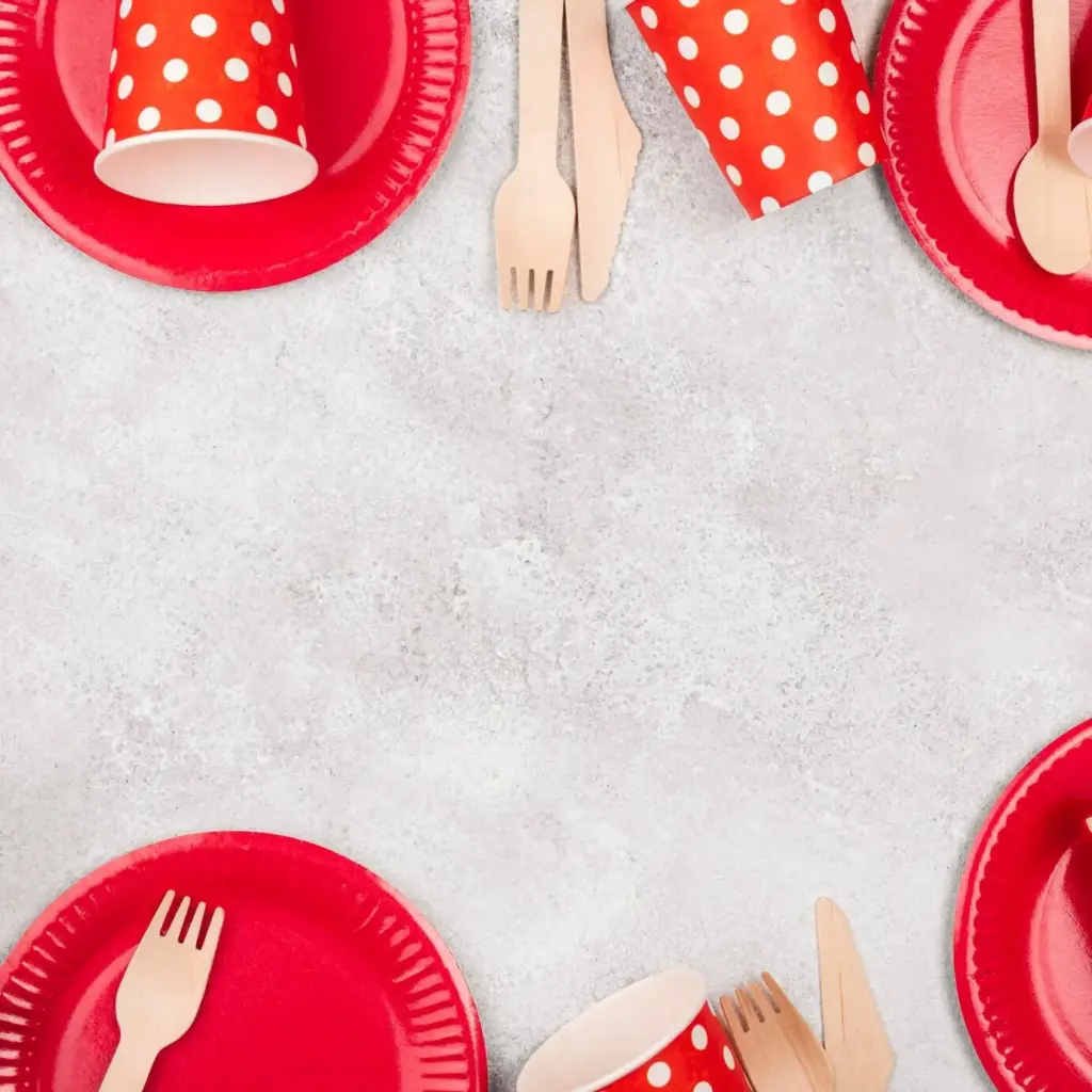
Modular Carpet Tiles and Indoor‑Outdoor Rugs
Peel‑and‑stick carpet tiles with releasable adhesive spot treat high‑traffic areas, add pattern, and lift for cleaning. Pair with indoor‑outdoor flatweaves for durability near doors and kitchens. Non‑slip pads stabilize edges, muffle sound, and shield original floors, satisfying lease rules while creating comfort your feet immediately appreciate.
Kitchen Glow-Ups That Pop Out When You Move
Bathroom Refresh That Survives Humidity
Storage That Looks Custom but Leaves No Trace
Freestanding Systems that Feel Built-In
Ceiling-Friendly: Tension Poles and Track Shelves
Adhesive Hooks, Strips, and the Science of Safe Removal

All Rights Reserved.